
Tech News
Unlocking Success: 10 Real-World SaaS UI/UX Design Success Stories
Great SaaS UI/UX design isn’t just about aesthetics. It’s about enhancing the user experience and making it easier for users to achieve their goals, whether it’s creating a workspace, launching a campaign, managing payments, or collaborating with a team.
The top SaaS brands don’t leave user experience to chance. They build around established UX patterns like progressive disclosure, clear dashboard hierarchy, onboarding checklists, contextual guidance, and consistent design systems that can scale as the product grows.

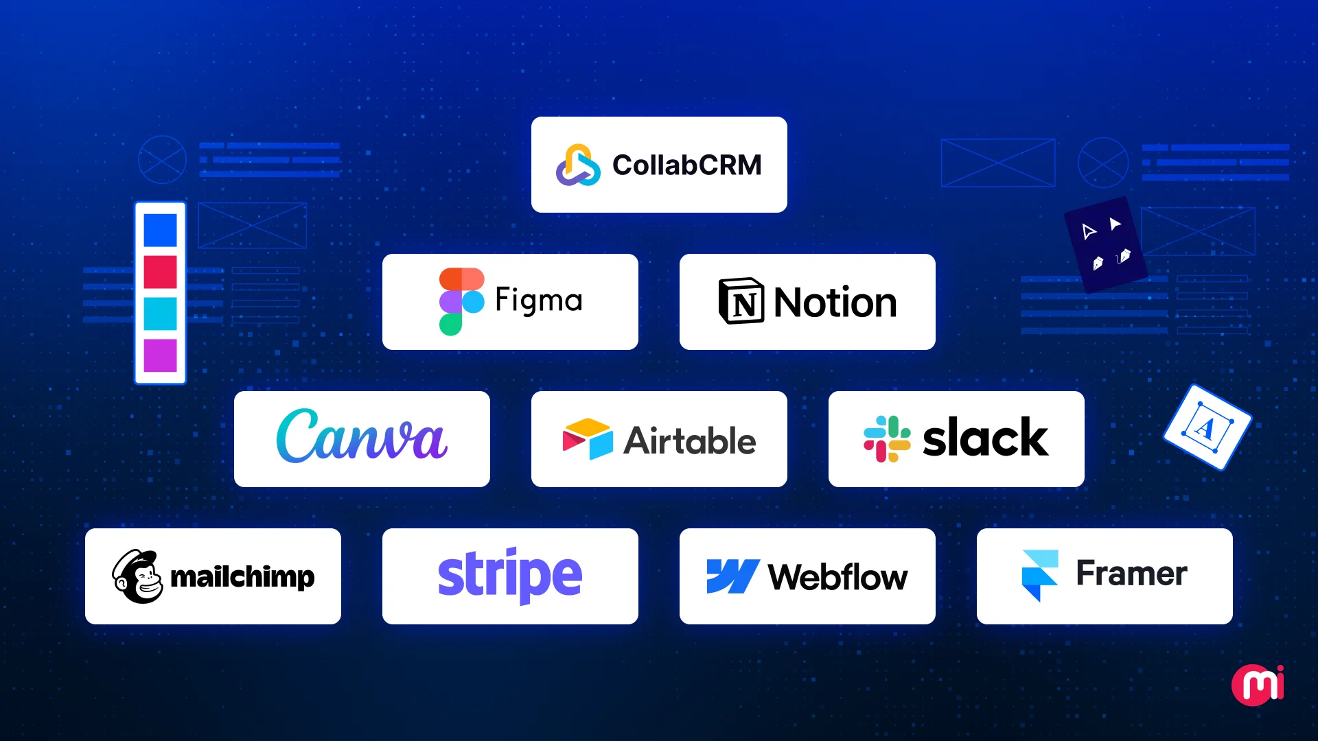
In this article, we will analyze 10 SaaS UI/UX case studies from brands like Notion, Webflow, Figma, Stripe, Airtable, Canva, Slack, Framer, CollabCRM, and Mailchimp. For each case study, we will break down:
So, let’s dive in.
KEY TAKEAWAYS
- Great SaaS UI/UX design focuses more on helping users reach outcomes faster with less friction, along with modern visuals.
- The best SaaS brands simplify complexity using repeatable UX patterns, not “unique” interfaces.
- Notion proves that flexible, feature-rich products can still feel simple when the UI stays minimal and complexity is revealed progressively.
- CollabCRM highlights a key enterprise SaaS lesson: multi-module products succeed when the UI stays consistent and workflows feel unified across departments.
- Figma shows how real-time collaboration and predictable UI patterns can drive team adoption at scale.
- Stripe demonstrates that in high-trust SaaS, clarity-first information design is essential for confidence and retention.
- SaaS design systems are needed as a scalability strategy for product consistency and faster delivery.
What Makes SaaS UI/UX Different From Regular Web Design
A typical website is designed to inform, persuade, and convert. A SaaS product is designed to perform. It has to help users complete tasks repeatedly, across multiple sessions, with minimal effort. That’s why SaaS UI/UX design is closer to designing a “digital workplace” than designing a marketing page.
Here’s what makes SaaS UI/UX fundamentally different:
- SaaS UX design has to support multi-step actions, repeat usage, role-based experiences, and complex information architecture.
- Great SaaS design anticipates growth with clean hierarchy, scalable components, and predictable patterns.
- SaaS UI/UX design puts heavy focus on guided onboarding, empty states that teach, progressive disclosure, checklists and quick wins, and contextual help.
- The best SaaS interfaces make complexity feel simple by using clear labels and microcopy, reducing choices per screen, prioritizing the most-used actions, and keeping dashboards scannable.
- SaaS product design is tied directly to retention and revenue.
Also Read: How UX Design Strategy Can Make Your Software Successful
10 Real-World SaaS UI/UX Case Studies
Every SaaS product has a different audience, workflow, and complexity level. But the best ones tend to solve the same core challenge: helping users reach value quickly, without overwhelming them.
In the case studies below, we are breaking down what actually matters in SaaS product design and what you can adopt for your SaaS design project.

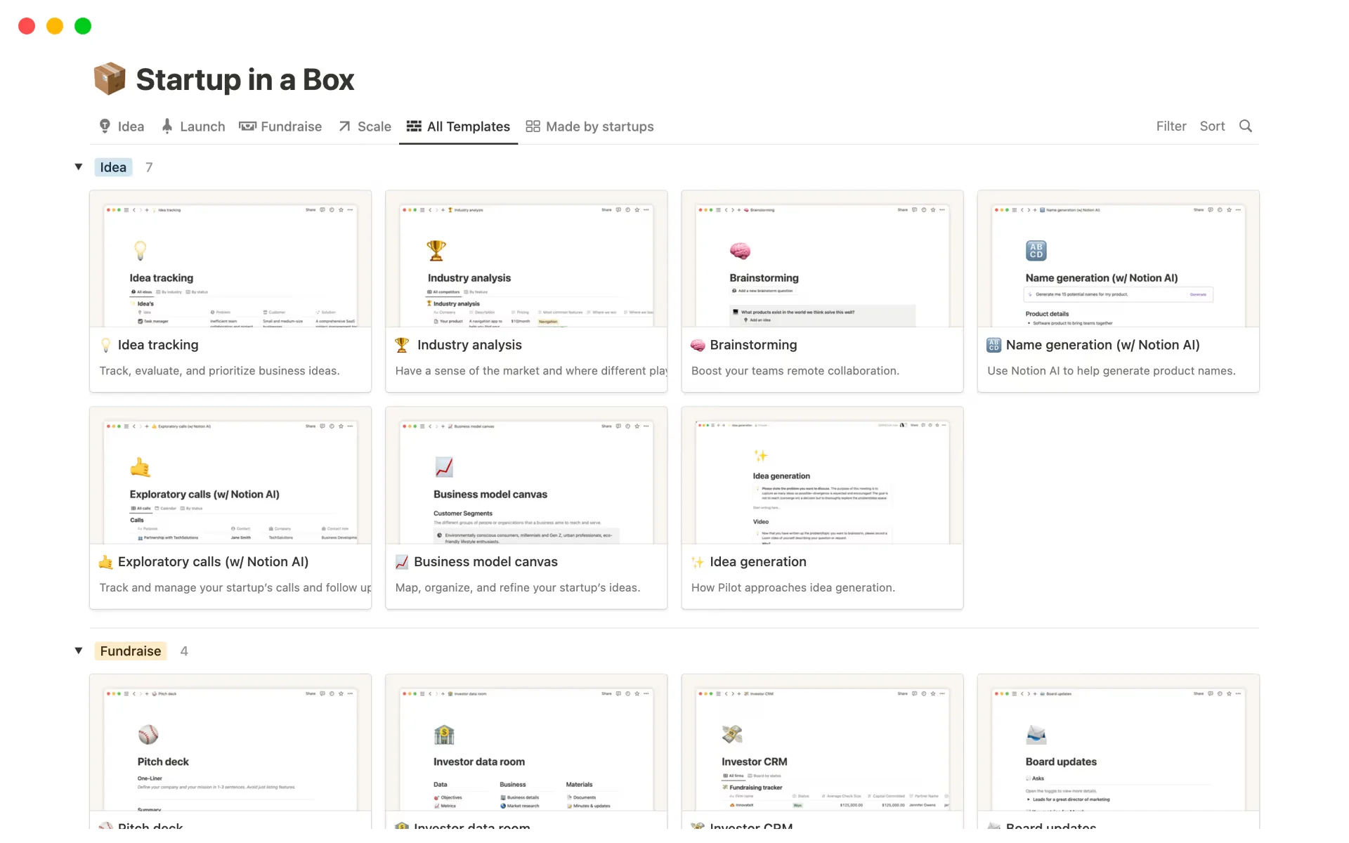
1. Notion
Notion serves as an all-in-one workspace that integrates notes, databases, wikis, and project management, making it ideal for teams and individuals juggling multiple tools.
Notion, as of early 2026, boasts approximately 100 million users worldwide and a $12 billion valuation, marking it as a major player in the productivity software market.
The company has shown rapid growth, with annual revenue passing $600 million in annual recurring revenue.
About Notion’s UI/UX design:
Before Notion, teams relied on multiple flexible tools, but there was no clean way to structure information. As content grew, navigation became messy, users struggled to find what they needed, and personal notes rarely scaled into consistent team workflows. Notion solved a core SaaS UX problem:
- How to offer deep flexibility without overwhelming users by keeping the UI minimal and revealing complexity progressively.
- It introduced a “block-based” UI that allows users to build custom workflows instead of adapting to them.
- Notion’s key innovation was changing the UI from a “container” (where you store things) to a “canvas” (where you build things), enabling users to structure their digital environment to match their personal workflow scenarios rather than the other way around.
UI/UX design principles Notion use:
Notion’s design principle is a minimal, distraction-free canvas with persistent sidebar navigation. Through this, Notion keeps the interface intentionally lightweight with a clean central workspace and minimal visual noise.
It also leverages “Lego-block” modularity and learn-as-you-build UX. It doesn’t force users to start from a blank page or learn everything up front, but uses templates and progressive disclosure to help users reach value fast without overwhelming them.
Key takeaway from Notion’s UI/UX design:
- If your SaaS product is flexible or feature-rich, don’t show complexity upfront.
- Keep the UI minimal, guide users with templates, and reveal advanced functionality progressively so adoption scales with confidence.
2. CollabCRM
CollabCRM is a unified business operating system specifically designed for IT companies to streamline operations by replacing fragmented tools.
Because of its navigational and intuitive UI and thoughtful UX, it saves organizations 3 hours per day per employee (gaining 25% productivity back), enables them to hire candidates 40% faster, and gives 100% visibility over revenue.

About CollabCRM’s UI/UX design:
IT businesses used to leverage multiple tools for multiple functions like people, recruitment, project management, sales, and more. But each time they switch tools, they feel like starting over with a new UI.
CollabCRM’s UI solves this by maintaining:
- One consistent navigation model
- Shared UI components across modules
- Consistent layout, structure, and actions
- Uniform interaction patterns (filters, tables, forms, statuses)
UI/UX design principles CollabCRM use:
CollabCRM’s strongest UI move is keeping the product organized around clear modules (CRM, HR, projects, invoicing, recruitment, etc.) while maintaining consistent layout, controls, and interaction patterns across them.
This eliminates context switching and makes the platform feel like one system, not a bundle of features.
Key takeaway from CollabCRM’s UI/UX design:
If your SaaS product includes multiple modules, don’t design them like separate mini-products. Build a consistent UI foundation and connect workflows end-to-end, because cross-module continuity is what drives real adoption in enterprise teams.

3. Webflow
Webflow is a cloud-based, no-code web design


Lawsuit Against SonicWall for Data Breach and Ransomware Attack

The Unwavering Xbox Strategy: Sticking to the Plan, No Surprises Expected

Unveiling the Innovative Honor MagicPad 4 Tablet at MWC 2022

Rise to the Challenge: Apply to Speak at Founder Summit 2026

Exploring the Dynamic Island: A Guide to Apple’s Touchscreen MacBooks

Unlocking Success: 10 Real-World SaaS UI/UX Design Success Stories

MagicPad 4: The World’s Thinnest Android Tablet According to Honor

Bold Burgundy: The New Trend in iPhone Design

Nokia and AWS Join Forces to Revolutionize Real-Time 5G Network Slicing with AI Automation

EU Takes Action Against Instagram and Facebook for Violating Illegal Content Rules

Warning: Facebook Creators Face Monetization Loss for Stealing and Reposting Videos
Facebook Compliance: ICE-tracking Page Removed After US Government Intervention

InstaDub: Meta’s AI Translation Tool for Instagram Videos

Facebook’s New Look: A Blend of Instagram’s Style

Facebook and Instagram to Reduce Personalized Ads for European Users

Reclaim Your Account: Facebook and Instagram Launch New Hub for Account Recovery

Meta discontinues Messenger apps for Windows and macOS

Breaking Updates: Meta Connect 2025 Unveils Latest Developments

iPhone 13 Pro Max vs 13 Pro / 13 / 13 Mini / 12 / 11 / SE – Battery Life DRAIN TEST

iPhone 13 PRO Review – The Final Verdict.

Vivo X70 Pro Plus – SO MUCH Camera 😂

25 Inventions that are Out of this World. 🌏

I’m worried about humanity’s future.

Google Pixel 6 Pro vs iPhone 13 Pro CAMERA Test.

Huawei is BACK….But there’s a problem 💀

Galaxy S22 Ultra – Samsung’s FINALLY doing it.

The most PRO phone money can buy.
-
 Facebook4 months ago
EU Takes Action Against Instagram and Facebook for Violating Illegal Content Rules
-
 Facebook4 months ago
Warning: Facebook Creators Face Monetization Loss for Stealing and Reposting Videos
-

 Facebook4 months ago
Facebook Compliance: ICE-tracking Page Removed After US Government Intervention
-
 Facebook4 months ago
InstaDub: Meta’s AI Translation Tool for Instagram Videos
-
 Facebook3 months ago
Facebook’s New Look: A Blend of Instagram’s Style
-
 Facebook3 months ago
Facebook and Instagram to Reduce Personalized Ads for European Users
-
 Facebook3 months ago
Reclaim Your Account: Facebook and Instagram Launch New Hub for Account Recovery
-
 Apple4 months ago
Meta discontinues Messenger apps for Windows and macOS