
Embracing the Gradient: Google’s Icon Design Revolutionizes More Apps
New Google Icons with Gradient Design Rolling Out
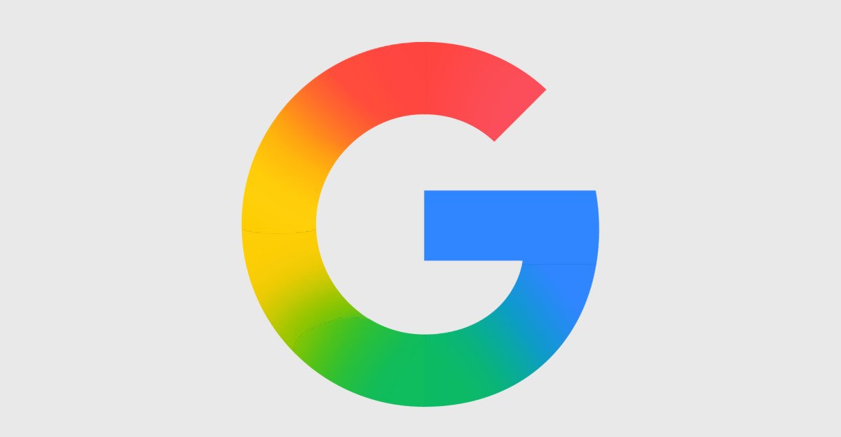
Google has recently introduced new icons with a gradient design, starting with a rollout in late 2025. These new icons are now making their way to other Google apps, moving away from the uniform circle design that previously incorporated all the colors of the Google logo, as reported by 9to5Google.
Softer and More Vibrant Look
The new icons feature softer looks with rounder corners and gradients that transition from pastel to more saturated Google primary colors. This design language has already been seen in updated versions of the Google G logo, as well as in apps like Gemini, Photos, and Maps. According to 9to5, these changes reflect the integration of AI-powered features.
Playful and Varied Design Trends
The new icons embrace playful, vibrant, and varied designs, following recent trends that have moved away from the flat looks of the late 2010s and early 2020s. Apps like Google Sheets, Slides, Forms, Sites, and Keep have shifted from a portrait-oriented sheet of paper look to a landscape layout, which is more fitting for their functions.
Visually Distinct and Improved Icons
Most of the new icons are considered improvements, being more visually distinct and often embracing a single color. For example, the Chat icon now features a green blob with a smile inside, reminiscent of the Google Hangouts icon. However, the Keep icon has received some criticism for its design.
Future Rollout of New Icons
While the exact rollout date for the new icons is unclear, it is expected to happen soon. Google users can anticipate a fresh and updated look across various apps in the near future.


The Search for Australia’s Next Startup Sensation: Meet the Judges

Customise your Android Smartphone – 2018 Edition.

Apple’s Next-Gen Processor: A Look at the Possibilities

Saudi Royal Family’s Rare Mercedes G-Wagon: A Luxury Auction Success

Integrating AI into Development: Prioritizing Security in the Workflow

Final Fantasy VII Remake Collides with Final Fantasy XIV in Epic Crossover Event

Revolutionizing Respiratory Diagnostics: TidalSense Secures €16.6 Million in Funding

Apple’s Privacy-Focused Smart Glasses: The Future of Wearable Technology

Privacy Controversy Erupts as Apple AI Live Notes at Genius Bar Raises Alarms

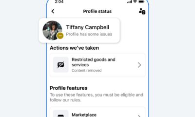
EU Takes Action Against Instagram and Facebook for Violating Illegal Content Rules

Warning: Facebook Creators Face Monetization Loss for Stealing and Reposting Videos

Facebook’s New Look: A Blend of Instagram’s Style
Facebook Compliance: ICE-tracking Page Removed After US Government Intervention

Facebook and Instagram to Reduce Personalized Ads for European Users

InstaDub: Meta’s AI Translation Tool for Instagram Videos

Reclaim Your Account: Facebook and Instagram Launch New Hub for Account Recovery

Meta discontinues Messenger apps for Windows and macOS

Breaking Updates: Meta Connect 2025 Unveils Latest Developments
Customise your Android Smartphone – 2018 Edition.

Top 5 Upcoming Smartphones in 2018 / 2019

a mystery smartphone just arrived.

My channel might be about to end

50 Smartphone Gadgets you might have NEVER seen.

World’s first Next-Gen Snapdragon 855 Smartphone.

Customise your Android Smartphone – ULTIMATE Edition.

My LOVE / HATE Relationship with Huawei Mate 20 Pro.

OnePlus 6T McLaren Edition UNBOXING
-
 Facebook9 months ago
EU Takes Action Against Instagram and Facebook for Violating Illegal Content Rules
-
 Facebook9 months ago
Warning: Facebook Creators Face Monetization Loss for Stealing and Reposting Videos
-
 Facebook8 months ago
Facebook’s New Look: A Blend of Instagram’s Style
-

 Facebook10 months ago
Facebook Compliance: ICE-tracking Page Removed After US Government Intervention
-
 Facebook8 months ago
Facebook and Instagram to Reduce Personalized Ads for European Users
-
 Facebook10 months ago
InstaDub: Meta’s AI Translation Tool for Instagram Videos
-
 Facebook8 months ago
Reclaim Your Account: Facebook and Instagram Launch New Hub for Account Recovery
-
 Apple9 months ago
Meta discontinues Messenger apps for Windows and macOS