
Google Unveils Refreshed Workspace App Icons for a Modern Look
New Look for Google Workspace Apps
Google Workspace apps are undergoing a transformation with a fresh new look. The redesigned app icons, which were leaked last month, are now being widely rolled out. Users may have already noticed the updated icons, featuring a gradient look that transitions from lighter to darker shades. This new design approach differs from the previous flat tone design and is reminiscent of the redesigned Google logo introduced a year ago.
Icon Changes
Some of the icons have undergone significant changes, such as transitioning from a rainbow design to a single color. Icons like Google Chat, Meet, and Calendar now sport a single-color design, which may help in distinguishing them from one another. However, these changes could also make them slightly harder to recognize. On the other hand, icons like Google Docs, Sheets, and Slides have retained their original colors and design approach. Interestingly, the Sheets and Slides icons have been rotated to landscape mode, aligning with how most users interact with these apps.
The Google Drive icon has also received a significant makeover with rounded corners and the removal of the red spot that was previously present in the bottom right corner. Some icons have also had their borders removed, like Google Keep, which now features a simple yellow light bulb design. While these changes offer a cleaner and more modern look, users familiar with the old designs may need some time to adjust to the new icons. Personally, I find the new design of the Google Keep icon appealing, despite the initial adjustment period. The Gmail icon has also been updated for a cleaner look, although the changes are relatively subtle compared to the previous version.


Revolutionizing Energy: How Software is the Key to Solving the AI Energy Crisis

Navigating the Enigma: The Challenges Faced by Actors in Mystery Box Shows

Maximizing Battery Life: A Comprehensive Review of the Motorola Edge 70 Fusion

Revolutionize Your Mac Desktop Organization with Gemini Spark – Worth the Investment

Empowering the Future: Introducing the 2026 EU Women Innovators

Ferrari Unveils V12 Manual Masterpiece: The 12Cilindri MM

Amazon Unleashes its Starlink Competitor: A Satellite Revolution

Cinder City: Optimizing Performance with Reduced RAM Requirements

Blueprint for Success: Crafting a Top-Tier Business

EU Takes Action Against Instagram and Facebook for Violating Illegal Content Rules

Warning: Facebook Creators Face Monetization Loss for Stealing and Reposting Videos

Facebook’s New Look: A Blend of Instagram’s Style
Facebook Compliance: ICE-tracking Page Removed After US Government Intervention

Facebook and Instagram to Reduce Personalized Ads for European Users

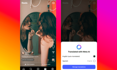
InstaDub: Meta’s AI Translation Tool for Instagram Videos

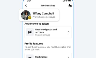
Reclaim Your Account: Facebook and Instagram Launch New Hub for Account Recovery

Meta discontinues Messenger apps for Windows and macOS

Breaking Updates: Meta Connect 2025 Unveils Latest Developments

12 Smartphone Gadgets you might not believe Existed.

Nokia 9 PureView – THIS is what FIVE Cameras can do.

Smartphone Fast Charging just got FASTER.

The Ultimate Galaxy S10 Camera.

World’s first “FREE TO USE” Smartphone?

World’s first REAL Wireless Charger.

Customise your Android Smartphone – 2019.

Huawei P30 Pro UNBOXING!

Huawei P30 Pro vs Samsung Galaxy S10 Plus
-
 Facebook8 months ago
EU Takes Action Against Instagram and Facebook for Violating Illegal Content Rules
-
 Facebook9 months ago
Warning: Facebook Creators Face Monetization Loss for Stealing and Reposting Videos
-
 Facebook7 months ago
Facebook’s New Look: A Blend of Instagram’s Style
-

 Facebook9 months ago
Facebook Compliance: ICE-tracking Page Removed After US Government Intervention
-
 Facebook7 months ago
Facebook and Instagram to Reduce Personalized Ads for European Users
-
 Facebook9 months ago
InstaDub: Meta’s AI Translation Tool for Instagram Videos
-
 Facebook7 months ago
Reclaim Your Account: Facebook and Instagram Launch New Hub for Account Recovery
-
 Apple8 months ago
Meta discontinues Messenger apps for Windows and macOS